Visualization of long- and short term stock movements
Aim
In this post I will explore, how correlations between long- and short-term stock movements can be visualized using R and ggplot2. I will look at the current German composite index DAX, but any other set of stocks–for which data are available–is feasible.
Procedure
Frist, the data need to be downloaded. For simplicity, I’ll download the necessary data twice, first, for the long-term changes, then, for the short-term changes. The data are first stored in a list–which greatly facilitates calculating returns in case of different time series lengths–and then transformed into a data frame, since that is what ggplot2 requires. The market share relative to the composite index was downloaded from an external source and then imported manually. Finally, the data are visualized using the ggplot2 package, which allows including multiple variables (aesthetics) into a single plot. While the y- and x-axis respectively reflect the short and long term change in the valuation of the stock, the size of the bubbles is set to indicate the stock’s market share within the composite index using current valuations. The color of a bubble indicates its long-term movement.
Benefits
The benefit of this approach is that short/long term valuations can easily be compared. Only the two variables, t1 and t2, need to be adjusted to look at different timeframes.
Results
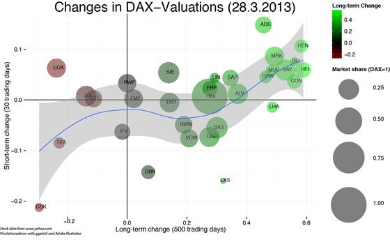
With a little tweaking in Adobe Illustrator, the following picture emerges. At least for the 500 vs. 30 trading days range, the momentum theory seems to be confirmed. Long-term strong stocks continued to outperfom, whereas weak stocks continued to underperform. However, this picture clearly exagerates the situation, since short-term changes are part of the long-term changes.

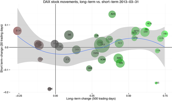
This can be easily fixed by changing the end date in the long-term data to Sys.Date()-t2. The graph that emerges now is clearly more balanced with the best performance for the strong loosers and the moderate winners.
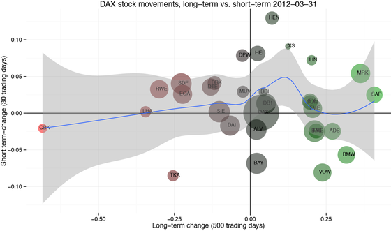
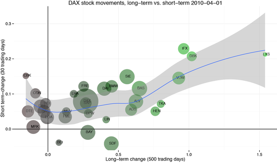
When looking at previous years, it becomes clear that relationship between long- and short term stock movements has been subject to constant change. So, rather than having a lot of predictive power, the value in such graphs is that they allow to get a good overview of the current market situation.


Code
require(tseries)
require(ggplot2)
require(scales)
require(ggthemes)
require(igraph)
require(gridExtra)</code>

t1<-365
t2<-7
SysD<-Sys.Date()

setwd("/Users/christophpfeiffer/Google Drive/05 Business-Projekte/Automatic Trade")
#setwd("C:UsersChristophGoogle Drive�5 Business-ProjekteAutomatic Trade")

#Long Term Change

dax.30<-c("ADS.DE", "ALV.DE", "BAS.DE", "BAYN.DE","BEI.DE","BMW.DE","CBK.DE","CON.DE",
"DAI.DE","DB1.DE","DBK.DE","DPW.DE","DTE.DE","EOAN.DE","FME.DE","FRE.DE","HEI.DE",
"HEN3.DE","IFX.DE","LHA.DE","LIN.DE","LXS.DE","MRK.DE","MUV2.DE","RWE.DE","SAP.DE","SDF.DE",
"SIE.DE","TKA.DE","VOW3.DE","^GDAXI")

u<-length(dax.30)

l<-list()
a<-c()
for(i in 1:u){
l[[i]]<-get.hist.quote(dax.30[i],start=SysD-t1,end=SysD-t2, quote="Close",retclass="zoo",compression="d")
#a[i]<-ROC(l[[i]],n=(nrow(l[[i]]))-1)[nrow(l[[i]])]
a[i]<-(as.numeric(l[[i]][nrow(l[[i]]),])-as.numeric(l[[i]][1,]))/as.numeric(l[[i]][1,])
}

names(a)<-as.character(dax.30)

## Short Term Change
l1<-list()
a1<-c()
for(i in 1:u){
l1[[i]]<-get.hist.quote(dax.30[i],start=SysD-t2,end=SysD ,quote="Close",retclass="zoo",compression="d")
#a1[i]<-ROC(l1[[i]],n=(nrow(l1[[i]]))-1)[nrow(l1[[i]])]
a1[i]<-(as.numeric(l1[[i]][nrow(l1[[i]]),])-as.numeric(l1[[i]][1,]))/as.numeric(l1[[i]][1,])
}
length(a1)
names(a1)<-as.character(dax.30)

#Join
df1<-rbind(a,a1) as.data.frame(t(df1))->d2
names(d2)<-c("LTCh","STCh")

#Add market share
gew<-read.csv("Dax.Gew.csv",header=TRUE,sep=";")
d2["Gewichtung"]<-c(as.numeric(gew$Wichtung)/100,1)

#Shorten stock names
nam<-rownames(d2)
nam<-substr(nam,start=1,stop=3)
nam[31]<-"DAX"

#Create plot
p1<-qplot(y=STCh,x=LTCh,size=Gewichtung,color=LTCh,label=nam,data=d2,alpha=I(0.5))
p1<-p1+geom_text(size=3,hjust=0.3,vjust=0.3,color="black")+scale_colour_gradient2(low="red", mid="black",high="green",guide="none")
p1<-p1
p1<-p1+xlab(paste("Long-term change (",t1,"days)",sep="" ))+ylab(paste("Short term-change (",t2,"days)",sep=""))
p1<-p1+theme_minimal()
p1<-p1+ geom_vline(xintercept = 0)
p1<-p1+geom_hline(yintercept=0)+labs(title=paste("DAX stock movements, long-term vs. short-term",SysD))
p1<-p1+geom_smooth()+scale_area(range=c(5,30),guide="none") p1 ##Create 2nd plot (number winners/loosers short-term) ##Count ifelse(d2$STCh>0,1,-1)->d2["STWL"]
ifelse(d2$LTCh>0,1,-1)->d2["LTWL"]
p2<-qplot(x=factor(STWL),data=d2,fill=STWL) + coord_flip()+theme_minimal(base_size=10)+scale_fill_gradient2(low="red",high="green",guide="none")
p2<-p2+labs(title="Short-term W/L")+ylab("")+xlab("")+scale_x_discrete(label=c("L","W"))+opts(plot.title = theme_text(size = 10))

p3<-qplot(x=factor(LTWL),data=d2,fill=LTWL) + coord_flip()+theme_minimal()+scale_fill_gradient2(low="red",high="green",guide="none") p3+ylab("")+xlab("")+scale_x_discrete(label=c("L","W"))+labs(title="Long-term W/L") qplot(x=STCh,data=d2,geom="density")+theme_minimal() qplot(x=LTCh,data=d2,geom="density")+theme_minimal() ggplotGrob(p2)->p2.i
p1+annotation_custom(grob=p2.i, xmin =1.3 , xmax =1.8 , ymin =0.06, ymax =0.1 )

#Save file
ggsave(file=paste("short vs long term",SysD,".pdf",sep=""),width=10,height=6)